In a comment on my previous post, Anonymous wrote
The EU Commission has come up with an "Economic Scoreboard" that's supposed to help warn of developing macroeconomic imbalances. Interestingly , they've chosen a threshold of 160% debt/gdp for nonfinancial private debt :
http://www.europarl.europa.eu/registre/docs_autres_institutions/commission_europeenne/sec/2011/1361/COM_SEC(2011)1361_EN.pdf
I think this will turn out to be too high , since it's based on calculations derived from the period from 1994-2007 , i.e. , the boom years.
I think it is too high, too. I'm replying here so I can display a graph.
A threshold of 160% of gdp for nonfinancial debt.
No.
For nonfinancial private debt. Sorry. Okay. Under Domestic Nonfinancial (TCMDODNS at FRED) one finds
Household sector
Federal Government
State and Local Governments
Farm Business
Nonfarm Noncorporate Business
Nonfinancial Corporate Business
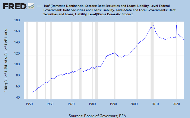
Gotta subtract Federal, State, and Local government debt to get private debt.
Okay, I can do that. But before I do...
Here it is. From a post that has not yet seen the light of day:
I always don't like it when big problems get talked down to little pieces. Take debt for example. The problem with debt is excessiveness. But people take debt and split it up into household debt, and corporate debt, and noncorporate debt, and financial debt, and government debt, and all of the pieces are pretty small, and the excessiveness seems to vanish, and then the problem seems to go away, but really nothing has been resolved, and I think it is nonsense.
So now I will go to FRED and find TCMDO DNS and subtract out the FG and SLG parts of it, and see what it looks like.
 |
| Graph #1: U.S. Nonfinancial Private Debt |
I know, the US is not the EU. But for the US, private nonfinancial debt at 160% of GDP was about two years away from the onset of crisis.
Why cut it so close? Why would we want to "warn of developing macroeconomic imbalances"? Why not just avoid them altogether? The whole graph shows chronic and growing imbalance. The only respite is the brief period from 1990 to 1993, which preceded and paved the way for the boom years that began in 1994.
Look at that graph again, the early years, to about 1965. That's a Golden Age economy, with minimal inflation. Then there's a kink in the trend and a slower increase during the Great Inflation.
I don't think the growth of debt slowed. I think the GDP number inflated up, and the faster-growing denominator gives us a slower-growing ratio.
What would be wrong with confining debt to the level it was at in the early 1960s? Before even the inflationary years. For I would gladly argue that the inflation resulted from the spending that was largely financed by all that debt.

I've been looking at the graph below for a few days, wondering what to say about it:
 |
| Graph #2 Financial debt as a percent of Nonfinancial debt (blue) Financial Debt as a percent of GDP (red) Nonfinancial debt as a percent of GDP (green) |
That first flat spot, thru the 1960s and '70s, sits at about 135% of GDP (as I showed earlier today).
The second flat spot, thru the 1990s, is well above 160%, at about 180% of GDP.
The third flat spot, in the current decade, rests at about 250% of GDP.
The numbers don't stop. It's not like we run out of numbers. We have to take the initiative ourselves and say No, not for our economy.
From a recent comment:
Another example of someone who doesn't quite get it - McKinsey :
http://www.businessinsider.com/us-debt-crisis-2012-3?op=1
They think it's just peachy that household debt/DPI is about to reach its long-term trend line , shown in Exhibit 7 , at about 100% debt/DPI.
That long-term trend line is , of course , upward sloping , implying that sometime in the future they will consider a 10,000% household debt/DPI just peachy too.
The decline we want is one that approaches that flat spot in the '60s -'70s.
That's what I'm sayin. But before the Great Inflation.

3 comments:
I agree that it's better to err on the side of caution when setting the thresholds , at least until we get updates to the work of Ceccheti , R&R , etc. , that can estimate the effects of the interactions of sectoral debt levels on overall stability. Right now it seems we have some numbers on the individual sectors , but not a good handle on what the combined total can safely be.
I just wish we were as far along in the discussion as the EU appears to be. Can you imagine the cries of "central planning !" and "economic micromanagement !" if we start talking about debt thresholds for the private sector in a serious way ?
According to the EU Commission paper , they intend to have guidelines for the financial sector as well by the end of 2012.
The U.S. and U.K would have to be dragged , kicking and screaming , into any such discussions.
Nonny, let me try to magnify the difference between you and me.
"I agree that it's better to err on the side of caution when setting the thresholds , at least until we get updates to the work of Ceccheti , R&R , etc..."
I don't see my position as "erring on the side of caution". If there is any truth to the debt productivity analysis, then certainly increasing the debt/GDP ratio does not boost GDP growth, and quite possibly it hurts growth.
If private debt at 180% of GDP creates a crisis, surely debt at 160% or 140% or 120% of GDP might be creating problems for the economy -- cost problems, resulting in sluggish growth and creating inflationary pressures, both. Resulting in what? Stagflation. And when did that problem first rear its ugly head? 1970, maybe? Maybe private debt at 90% of GDP was creating problems for us already in 1970.
If debt is the problem, we will never solve the problem until we take debt out at the knees.
My view is that the accumulation of debt hinders growth, and therefore the accumulation must be reduced. My target is to get back to the debt/GDP ratio we had in the early- to mid-1960s. Or, preferably, the debt/M1 ratio. (In truth, my goal is to find the most productive range for the debt/M1 ratio, and then stay within that range. In real-time, the early- to mid-1960s had the most productive ratio. But technology and habit and experience and conditions have evolved since then, and a much higher ratio might be best today. But not as high as we are. still.)
In the meanwhile, any decline in the ratio is a step in the right direction, opening a door to "miracle" growth for a few years, as the 1990-93 decline on Graph #1 above opened the door to the late-1990s boom.
I think we're in the same ballpark on the general idea. I may be a little more open to the idea that increased credit has benefits to economic growth that should be weighed when setting thresholds , but broadly I agree , for the U.S. anyway , that the debt/gdp levels we had during the '60's would be a good target to aim for.
Things have changed enough since then that even those levels of household debt/gdp , for example , may be too high. We're a much more unequal society now , and I suspect that high inequality tends to reduce the safe aggregate household debt/gdp threshold , at least when credit is widely available ( as it was during the housing boom ).
Switzerland has a very high household debt/gdp level , but many analysts don't see that as a problem because most of the debt is carried by the relatively wealthy / high income , who are the only ones that can afford - and thus qualify for the loans - to purchase houses.
Post a Comment